About a year ago, I was about to grab sushi at Union Station when I got a strange call. Apparently, someone had given my number to a guy named Marc Sampson and he wanted some advice about what journalists were looking for in a personal site for some vague sounding startup. I talked to him for about 20 minutes, and promptly forgot about the conversation until I received an email earlier this week about the beta launch of the project.
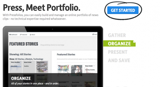
Pressfolios is a startlingly simple concept: It’s an online portfolio for press clips. The interface is clear, easy and quick. Intuitively designed, it does wonders for time-strapped journalists — you essentially click what you want to change, be it a picture, a tag or key details. The standout feature is the easy updating for new stories and columns. Instead of having to code them, you simply enter the link and it appears as an elegant and inviting little box.
Earlier in the week, I spent about three hours on my personal website updating a vast backlog of stories — I ultimately scanned, sorted, and uploaded seven stories and made quite a few needed updates. I also spent a lot of time visually formatting the posts, even though I am still not quite happy with the results. On Pressfolios, I spent three hours again, but I uploaded 30 stories in the same time frame. The application also makes the uploading process a lot easier for bloggers. When I wrote for Jezebel.com, we were required to crank out four to eight posts a day. I did that for eight months. While I was proud of my work at the site, I generally had to settle for only featuring one or two of my pieces; who has the time to go back and code all those links? Pressfolios’ easy uploading allowed me to give my old work new life.

The importer is a bit temperamental at times — it tends to cut off long titles, but you can go in and manually edit. It can get confused if there are multiple images on the page and it also generates a PDF to download the story. Unfortunately, it obviously doesn’t work for stories that are print only. That’s still going to take some manual cutting and pasting. And it isn’t clear yet what will happen if a website goes offline — does the PDF stay forever? Or is that work lost (which happens, far too often, to those of us writing in this ephemeral online medium)?
Entering my bio was also a bit taxing, as a multi-paragraph bio looks garbled on the backend. The system does not accept HTML formatting so there was no way for me to indicate breaks between paragraphs. However, the system eventually sorted this out on its own. Once I hit preview, the breaks were there in the areas I had intended.
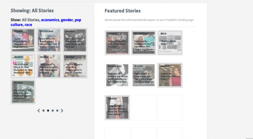
Tagging is confusing. Instead of WordPress style, where you can add multiple tags in one go, this version seems to only allow one tag at a time, with no clear way to go back and add more. After more tinkering, I realized that trying to control the tags in the post was too hard. It’s better to control tagging from the dashboard and then go back and apply it to individual posts. Also, be very careful when selecting tags. Since they show up as a way to organize your work on your public-facing page, it’s important to choose broad categories. You can also select which stories you want to feature, in another beautifully designed drag-and-drop system.
The design was also gorgeous, although limited. The finished product has an impressive look. Showing my friends my Pressfolios page and my current website, they overwhelmingly preferred the Pressfolios page. But there are limitations, design-wise. With my WordPress site, I can change my overall theme template on a whim. Pressfolios doesn’t even offer an alternate color scheme, much less different font options. I happen to really like the modern box feel, but for those who don’t, there are no other options.
For journalists without websites, Pressfolios could be a good solution. For bloggers, this may be the only solution on the market that can keep up with a large body of work with a minimum amount of effort. But for people with a more complex job, Pressfolios may leave something to be desired. I found myself wishing for a “check me out on Pressfolios” widget; although Pressfolios is wonderful for featuring stories, anything more complicated would be too tough to code. Those of us who are journalist hybrids are constrained to explain what they are doing in blog posts. While I’m sure we could hack around it, Pressfolios won’t show off a developer-journalist’s skills to the fullest, and may not be able to handle photojournalism. As a writer-speaker-consultant, I see Pressfolios only speaking to one area of my expertise, so I wouldn’t want to make it my sole web presence.
Pressfolios is still in beta, so pricing is still changing rapidly. Sampson explained that there will be a two-tiered model after the beta — a basic version that will be free and provide space for 40 stories, and a premium version that will allow for custom domains (yourname.com, as opposed to yourname.pressfolios.com) and unlimited storage. However, Pressfolios can solve the free space problem … if you are willing to market for them. For each friend you refer to the service, both you and your friend get an extra five stories’ worth of space. Pricing will be set after the beta, but Sampson says it will be “very reasonable … we realize journalists aren’t flying around in private jets.”
But it cannot be denied that Pressfolios works like a dream — data in, pretty out. And if you’ve been neglecting your personal website for some time, Pressfolios might just be your lifesaver.


